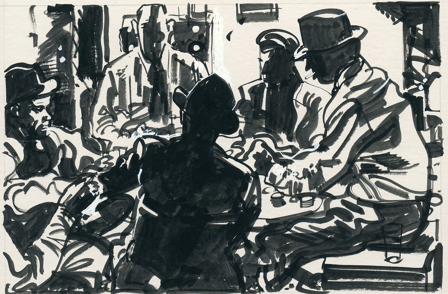
Golden-Age illustrators, such as Robert Fawcett below, often planned their compositions in black and white, throwing big areas into inky black shadows.
(Scan courtesy Illustration Art blog.)
Painters have to work at creating contrast. If we don’t, our paintings get the “middle-value-mumbles,” the tendency to paint everything in the middle of the tonal range.
Here’s a good exercise to cure yourself of the middle value mumbles. Do a sketch where everything in the light is rendered in white and everything in shadow is stated in black.
I’ll show you the idea executed in several different media. The medium or technique doesn’t matter; the idea does. In this picture I used a brushpen with no pencil layin. The faces are people in an audience listening to Irish music. They were lit by a single light bulb overhead.
For this to work, you need to have a subject lit by one light source, or by the sun. Try to ignore the actual local color. Push everything to dramatic extremes. The effect will resemble an old photo or a painting that has been photocopied a million times. Try not to use any lines. Define everything with shapes. For the picture below of the library, that meant leaving off the vertical lines on the right of the columns and the horizontal lines defining the stairs.
I laid in the drawing in pencil, and used a fine Micron pen and a marker for the shadows. I drew it in daytime from across the street. I had a hard time deciding whether to make the sky white or black.
If you evaluate the library image in “Image/Adjust Levels” in Photoshop, the histogram looks like a wide flat valley (no middle tones) with tall peaks in the black and the white.
Here's the idea carried out in oil at a sketch group. I used pure titanium white and ivory black, each with its own brush, working over a dark gray ground.
It takes supreme determination to avoid the temptation to blend the colors into greys. Don’t give in! Let edges disappear! The viewer of your picture will not mind seeking out or imagining the edges that you have to leave out.
I’ll be in California later this week at Lightbox Expo. Here’s my schedule
That was so inspiring ! You make me want to get into my car, drive up to Petaluma, and to try and draw and paint their lovely Public library ( All old Stone and masonry; rare for California), in your high contrast technique ! If not tomorrow, - very soon !
Part of the charm of vintage pulp magazines is precisely this type of illustration. It really does add a lot to the atmosphere of the story when you're looking at those high contrast, black and white illsutrations.