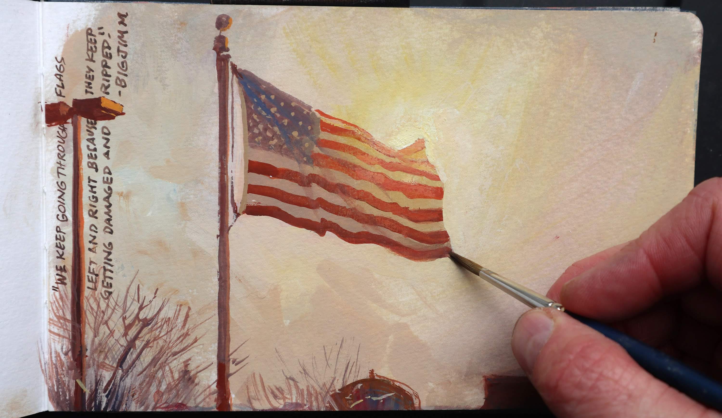
Flags never actually appear with undulating folds parallel to the flagpole. Instead, a set of folds radiates diagonally downward from the upper point of support.
The seven flags below are all variations on the “wavy ribbon” idea, which is how we think flags should look.
In fairness, there’s nothing wrong with this way of drawing flags—if your goal is to represent the mental image of a flag. A cartoonist is usually after the mental image, not reality. It’s also a good way to represent a flag if you want to show the flag's graphic design clearly.
But if your goal is realism, it’s worth observing the way those folds go outward from the upper corner.
I was unaware of this principle until a day in 1995 when I was stuck in rest stop during a long bus trip through the midlands of England. There was nothing to do but sketch and nothing to sketch but a flag. I drew a page of variations as the wind changed from a zephyr to a stiff breeze.
Good old gravity. Another great example of what our brain thinks a flag should look like versus what our eyes tell us when draw and paint from life. Thanks for this pearl, James.
I’ve always wondered what was wrong with my flags, now I know! . Thanks for sharing all your excellent painting advice over the years, it’s always welcome, always enlightening!