

Show Card Writing
A Nearly Forgotten Art Form

If you were to walk into any store, pharmacy, or theater lobby 100 years ago, you would be see handmade advertising signs everywhere.
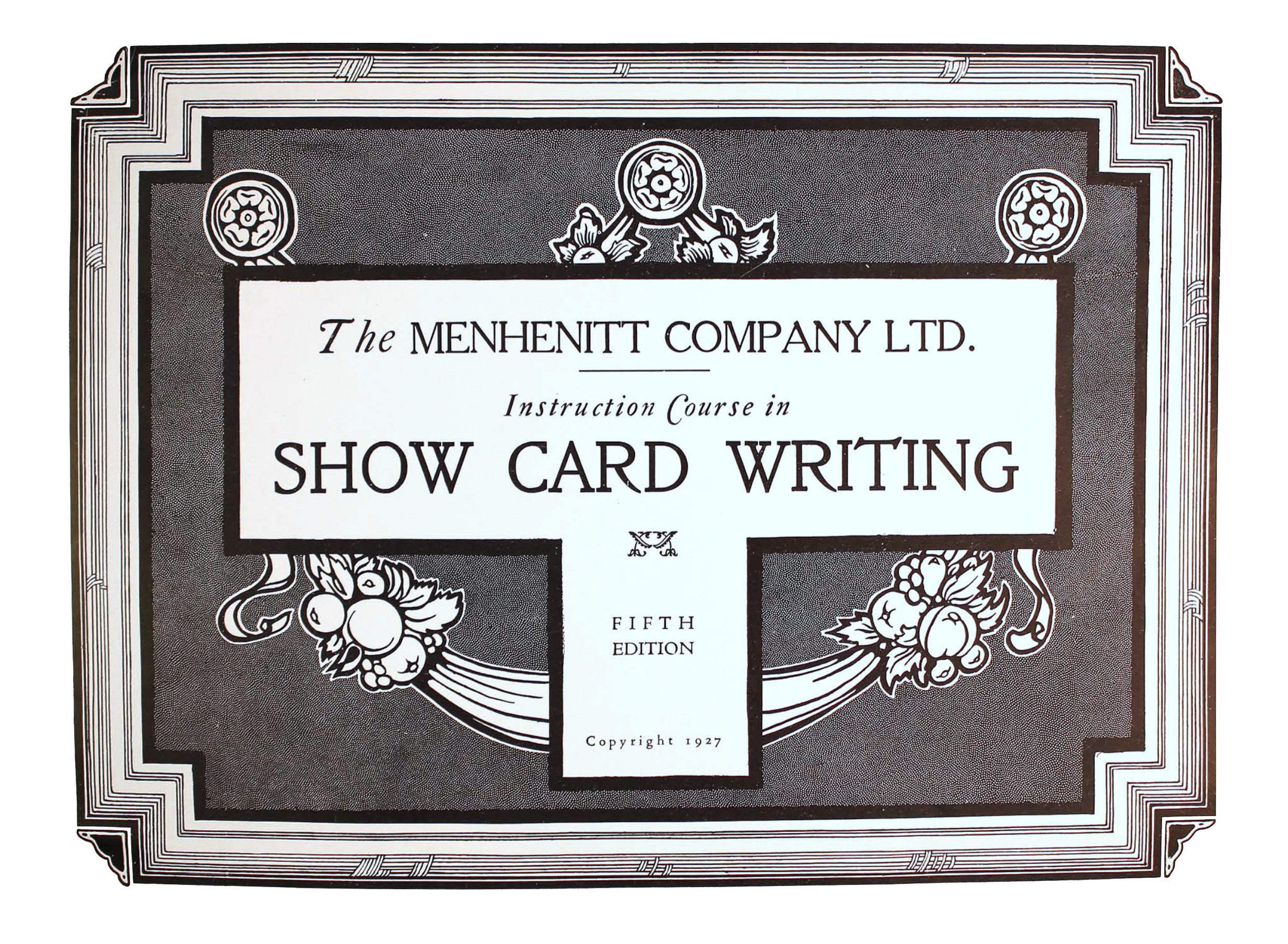
Menhennit Course in Show Card Writing, 1927
These were called “show cards” and they were big business for commercial artists.
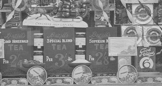
Shop window, Waterford, Ireland, 1926
The business was going on all around the world, but it was very local. Just as every town had work for a cobbler and a blacksmith, it also had a show card writer, sometimes many.
Show card writers would tell you that theirs was a different profession from sign painting, engrossing, or calligraphy, with different tools, techniques, and workflows. They called themselves “writers” instead of “letterers” or “sign painters.”
William Hugh Gordon, one of the masters of this art, said that the lettering “is really written, so called because [it was] produced by the rapid single stroke method, much the same as writing, regardless of whether a brush, pen, or other device is used.”
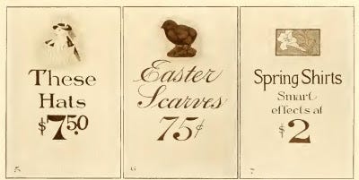
The golden age of the show card was between about 1890 and 1920. Show card artists employed by the larger stores often had drawing and painting skills to add to the lettering.
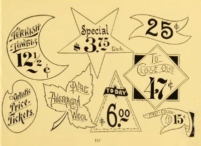
Price tags, or “price tickets,” as they were called then, were surrounded with border devices, which went in and out of favor.
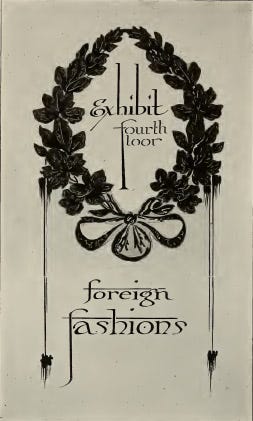
Although show cards were were ubiquitous, they were also ephemeral and disposable. Painted on cardboard, few of them survive today.
Happily, there has been a solid revival in show card writing often as a reaction to machine-made signs. Upscale cafés and sandwich shops use hand lettering for their menus and specials; boutique grocers like Trader Joe’s often have excellent hand lettered signs. Some of the great artistic cultures, such as Ireland, never lost the art. For the rest of us, rediscovering it, hand-made signage is becoming again what it once was: a mark of quality and distinction.
On Friday we’ll look at tools and techniques of the show card writer.
Oh my goodness! You have totally made my day. I’ve long been interested in this art form, which was still being practiced in some stores in the 1970s. The grocery store I worked at posted their “specials” on banners in the windows — huge sheets of white butcher paper with beautifully hand-written lettering, made with big brushes and poster paint. They also created hand written show cards for fresh produce because prices changed regularly. The antique stores sell these show cards and posters now. They have, HAD, a style of typography all their own. The chalkboard menus we see now are a welcome echo of what used to be so common.
One of my favorite (current) examples of this is Zingerman’s in Ann Arbor. https://zingermansart.myshopify.com . Going to zingerman’s when I was little was what made me want to go into design/illustration.