Timothy wants to know how I choose which moment to illustrate when I’m developing an illustrated book like Dinotopia.
He says: “Naturally some scenes have an innately cinematic quality that almost beg to be painted (such as a parade), but there’s also the smaller moments. Why, for example, might you decide to do a vignetted portrait of Bix or Crabb, vs showing them in situ like Enit and Nallab in the library? When you could illustrate every scene and character in your book, what makes you pick the ones you end up doing, and which are close details vs expansive vistas?”
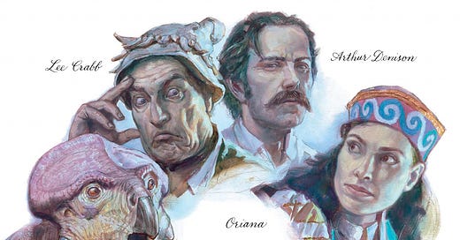
You’re absolutely right, Timothy. In some pictures I step outside of the flow of the narrative and do a vignetted portrait, such as this one from Dinotopia: The World Beneath:
Other times I’m interesting in establishing the setting and the mystery of the moment.
Here we see Arthur Denison in his laboratory, surrounded by intriguing objects, with his attention focused on a mysterious transparent six-sided pyramid. In the text he lays out his initial plan for the adventure.
Occasionally I pick a moment of peak action, freezing an instant when the main character is in peril or when two conflicting forces in the story come into dramatic opposition.
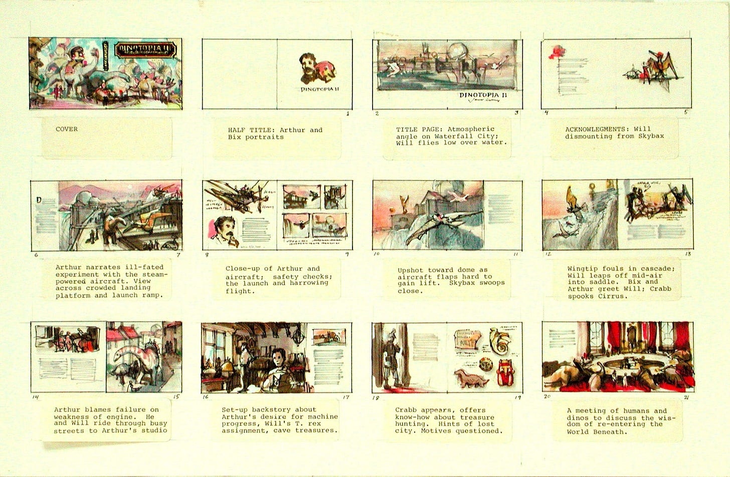
The place I make these decisions is the storyboard, which combines a thumbnail for the page and the gist of what the text will cover.
Let’s dig deeper into this question of which moment to illustrate. I’ll illustrate a couple of different strategies with prime examples by artists from the past that I admire.
Stillness and Action / The Supreme Moment
A painting presents itself to the viewer in its entirety, with everything visible at once. Without multiple panels or animation, you can show only a single moment.
Keep reading with a 7-day free trial
Subscribe to Paint Here to keep reading this post and get 7 days of free access to the full post archives.


