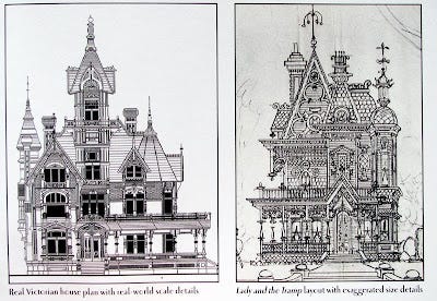
In the book The Art of the Princess and the Frog, author Jeff Kurtti compares two architectural drawings.
On the left is a real Victorian house plan, drawn to scale. On the right is a layout from Disney's Lady and the Tramp (1955), showing how the smaller details, such as finials and scrollwork, were exaggerated in scale to make them read on film and convey the charm of the setting.
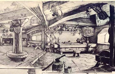
This process of "form thickening" was well established in Disney's Snow White and Pinocchio (1940). In this detail from a layout of Geppetto's house by Gustaf Tenggren, the furniture and props and timbers are all about twice as thick as they'd be in an actual interior.
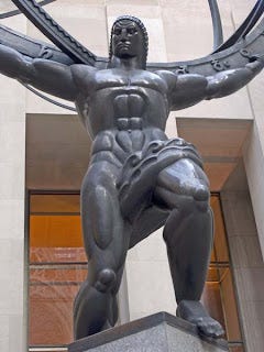
Heroic sculpture from the 1930s also used form thickening. The figure of Atlas is the centerpiece of Rockefeller Center in New York. The 15 foot tall bronze sculpture by Lee Lawrie and Rene Paul Chambellan also has convex surfaces and strongly defined subforms.
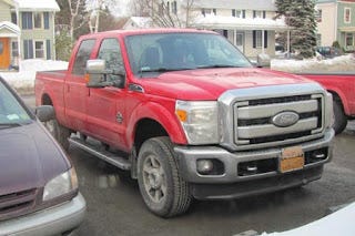
American pickup trucks 2012 and 2024
Form-thickening hasn't gone away. In pickup trucks for the last decade or so, all the details are massively overscaled, which suggests brute force and power. One of the sites advertising the truck describes the Ford logo as "football-sized," quite a bit heftier than the mango-sized logos on most other vehicles.


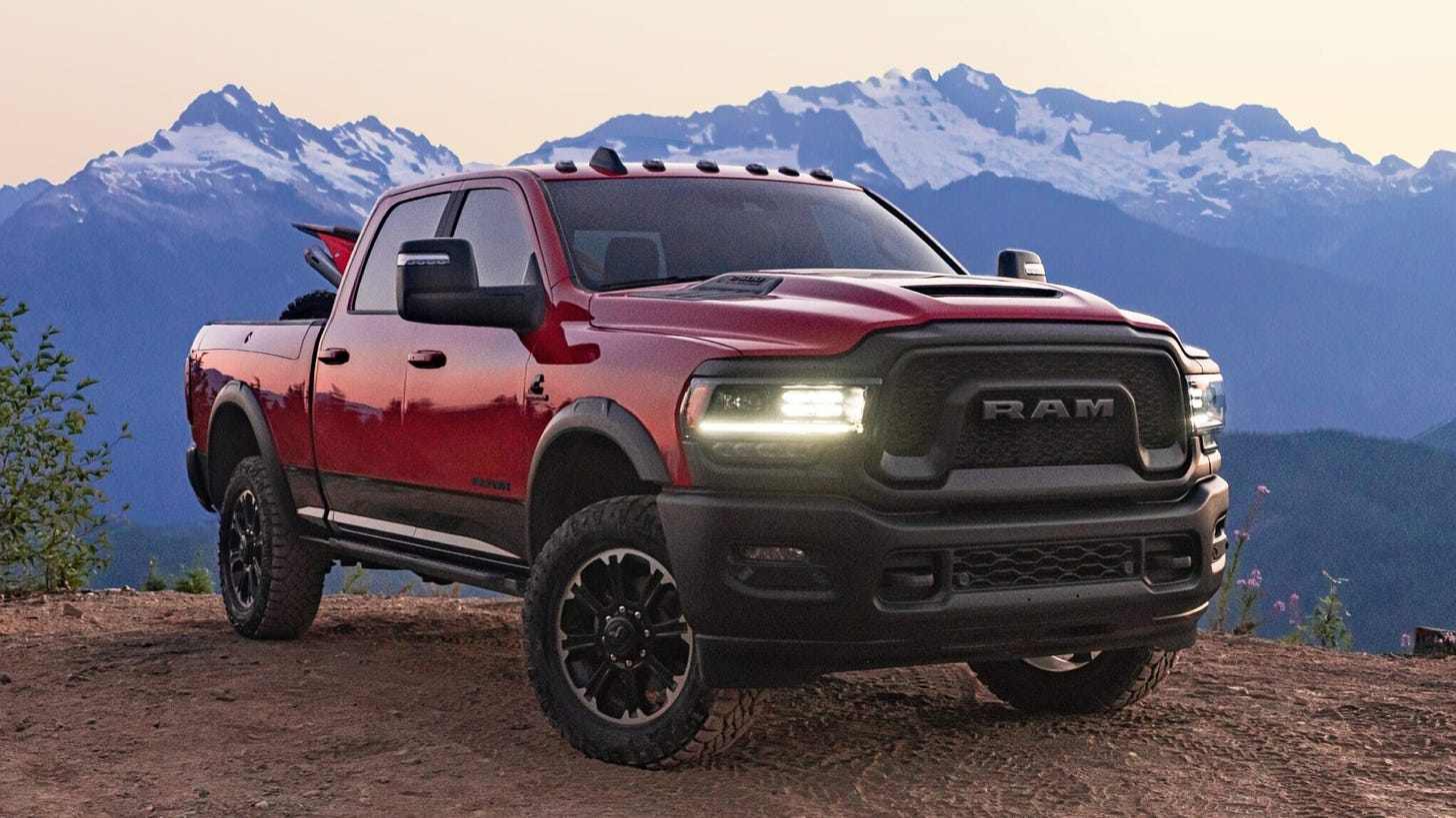
I liked it in the sketches, but hate in in the truck. They're so honking big and in your face to start with. Like they're meant to intimidate.
I like this… it’s something in front of us, everywhere, but calling attention to it and giving it a name is helpful.