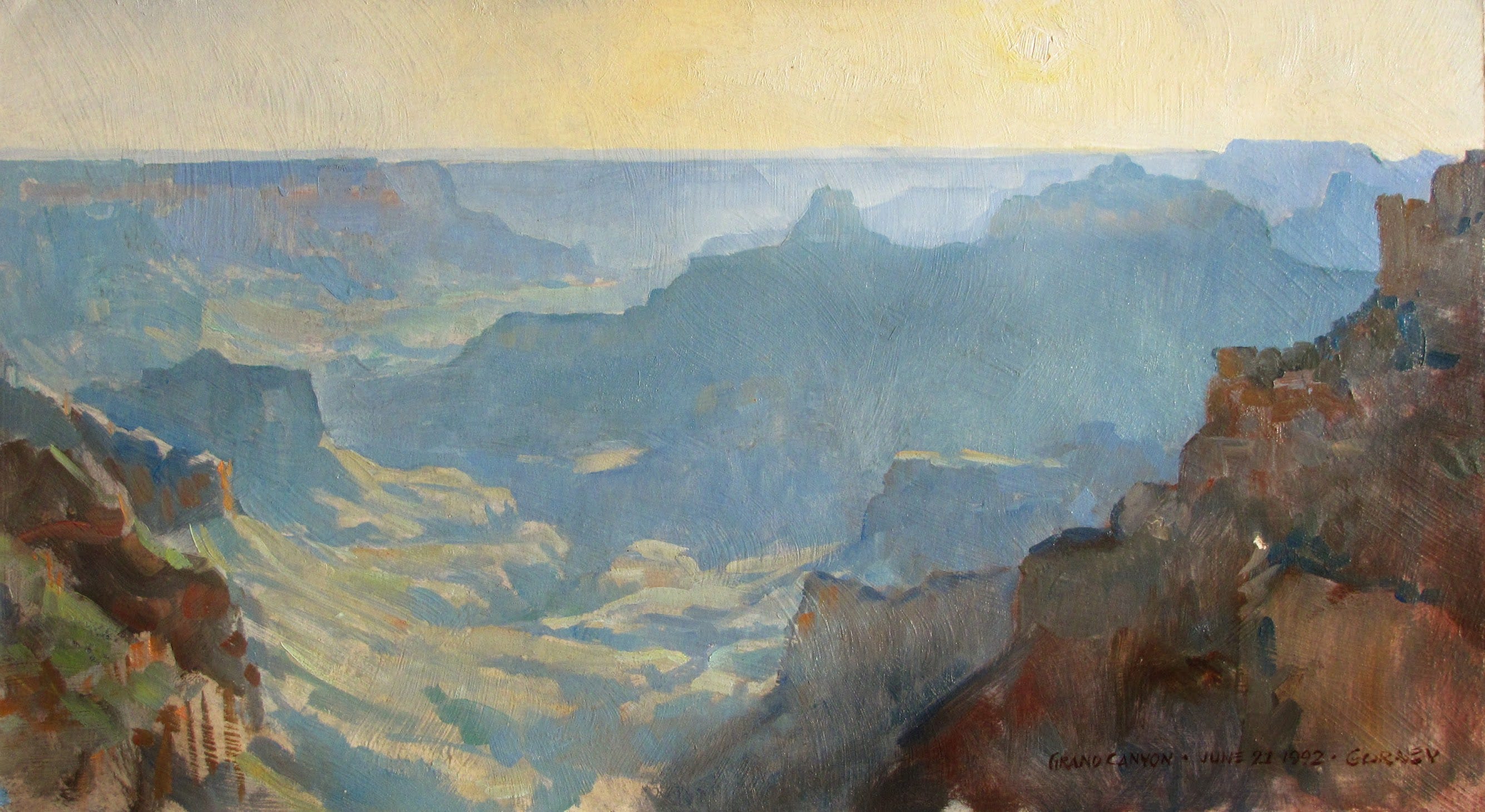
Plein-air study painted in oil on the north rim of the Grand Canyon, looking west.
Blog reader Rockhopper asked why tones get lighter in the distance as a result of atmospheric perspective:
“How do you define value as the image recedes? I know it gets lighter and I know it goes bluer. Is there a rule in place to define distance with the value? So for example a mountain is 10 miles away, is the mountain at 20 miles way half the value of the 10 mile mountain?”
Here’s a preliminary answer. As you can see, I’m still trying to figure this one out:
I’ve always assumed it’s a linear progression. In other words, if a dark tree near you is a #8 value (with white=0), and the farthest hill twelve miles away is a #2, then dark objects will shift one step lighter in value for every two miles of distance. But the more I think about it, I have a hunch that this assumption may be wrong. I have a feeling there’s more to it.
Let’s begin by supposing that the air is evenly distributed with dust and moisture and that the volume of air is equally illuminated throughout.
Would it be reasonable to suppose that looking through atmosphere is like looking through an evenly spaced series of wedding veils? Each parcel of air introduces a fixed amount of additional scattered light.
By this way of thinking, the tonal shift relative to distance would be geometric rather than linear. In other words, let’s suppose you suspend wedding veils 20 feet apart from each other in an infinite progression away from the observer. To test the lightening effect, you can have a person with a black velvet coat stand behind the first veil, then run back a little farther and stand behind next, thereby being obscured by two veils. The process continues as the subject goes back in space. Now let’s suppose each layer of wedding veil makes the black 50% lighter. The resulting value progression would be #10 @ 20 feet, #5 @ 40 feet, #2.5 @ 60 feet, #1.25 # 80 feet, etc, continuing toward pure white.
I have a hunch, too, that our perception of steps in value is influenced by features in our visual system just as much as it is by external reality, and that the whole problem is beyond any easy math.
I remember reading that the perceptually based value scale that we know from art school is not as simple as it seems. The change in the actual amount of light coming to the eye at each step in the value series is not a linear progression of constant units, like the markings on a water beaker. Instead, it’s a non-linear relationship, with each step representing a much greater volume of light than the last. As David Briggs puts it in his excellent website HueValueChroma, “value has a nonlinear relationship to luminance - a surface that looks visually halfway between black and white reflects only about 18% of the light energy reflected by a white surface.”
So what’s really going on?
It turns out that atmospheric haze works by what physicists call the Beer Lambert Law. Each equal layer of air doesn’t add a fixed step of lightness. It transmits a fixed fraction of whatever light passes through it and adds a fixed increment of scattered “airlight.” Both processes are multiplicative, not additive. If one veil lets through 90% of the dark object’s light and lays a veil of scattered blue over it, the second veil does the same to what’s left, and so on. The dark object approaches the brightness of the haze along a decaying curve, fast at first, then slower, never quite arriving.
So the linear hunch (one value step per two miles) is wrong as physics. A dark object loses contrast against the haze quickly when it’s near, then the lightening slows as it recedes. The far hills crowd together in value while the near ones spread apart.
But here’s the twist: Your eye doesn’t read luminance. It reads roughly the cube root of it. The value scale from art school is built around perception, where middle gray sits at 18% reflectance, not 50%. That perceptual compression works in the opposite direction from the haze curve. The atmosphere bunches the far distances together in physical luminance, and your visual system stretches the dark end back apart. The two curves fight, and they partly cancel.
Love to know your experience.
Thanks to everyone who has contributed to this forum by supporting it financially.
In a Greg Manchess video he paints a polar bear, working up from dark to light. Once he begins the fur it seems no matter how much white he adds he never reaches pure white.
I have another complication (besides being weak at values). We live on the big island of Hawaii at 1500 ft elevation. In the course of a day we might drive down to sea level or up to 6,000 ft with the peaks just shy of 14,000 ft. Besides clouds or humidty above, below of around us, we get periodic volcanic smog (vog) that can also vary in altitude and intensity!
Another analogy from Photoshop: to shoot my art cleaner I'll stack exposures (if I'm able to trigger the shutter without affecting the camera). To evenly combine layers I'll work up from the back 100%, 50%, 33%. 25%...
I can see the 'analytical' side of the mind at work here, trying to overlay a formula onto this concept, to arrive at a perfect interpretation of the scene. I prefer to use the 'creative' side of the mind to work it out. To my students who are over-rendering an oil painting, I say "it's not a police report, it's poetry". I believe that same idea can apply here; leave some room for poetry in your interpretation. There isn't a right or wrong in how faded the distance (or middle) should be. A heavy mist or smoke would change it anyway. The paintings of the same scene done by several different painters would vary anyway. Are some of them right and some wrong?? Hardly. There is a great latitude in depicting what is correct. My students seem to have a difficult time painting that distance as blue or as light as it is. They almost always want to paint it darker, greener, or more saturated than it is. I tell them that to achieve a "perfect" level of atmospheric perspective, they must overshoot the goal... paint it even cooler, even lighter, and even less saturated that you think it should be. If you can surrender to that, you may get closer to the poetic depiction that you seek.



In a Greg Manchess video he paints a polar bear, working up from dark to light. Once he begins the fur it seems no matter how much white he adds he never reaches pure white.
I have another complication (besides being weak at values). We live on the big island of Hawaii at 1500 ft elevation. In the course of a day we might drive down to sea level or up to 6,000 ft with the peaks just shy of 14,000 ft. Besides clouds or humidty above, below of around us, we get periodic volcanic smog (vog) that can also vary in altitude and intensity!
Another analogy from Photoshop: to shoot my art cleaner I'll stack exposures (if I'm able to trigger the shutter without affecting the camera). To evenly combine layers I'll work up from the back 100%, 50%, 33%. 25%...
I can see the 'analytical' side of the mind at work here, trying to overlay a formula onto this concept, to arrive at a perfect interpretation of the scene. I prefer to use the 'creative' side of the mind to work it out. To my students who are over-rendering an oil painting, I say "it's not a police report, it's poetry". I believe that same idea can apply here; leave some room for poetry in your interpretation. There isn't a right or wrong in how faded the distance (or middle) should be. A heavy mist or smoke would change it anyway. The paintings of the same scene done by several different painters would vary anyway. Are some of them right and some wrong?? Hardly. There is a great latitude in depicting what is correct. My students seem to have a difficult time painting that distance as blue or as light as it is. They almost always want to paint it darker, greener, or more saturated than it is. I tell them that to achieve a "perfect" level of atmospheric perspective, they must overshoot the goal... paint it even cooler, even lighter, and even less saturated that you think it should be. If you can surrender to that, you may get closer to the poetic depiction that you seek.