


Warm and Cool Colors
Warm and Cool Colors
Blue vs. orange is the strongest opposition
The most basic color relationship is warm against cool. Mammals can see it. Color-blind people usually can see it, even if they can’t perceive green and red.
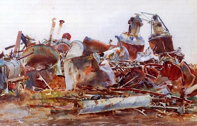
Why did John Singer Sargent choose to emphasize those browns and blues in his plein-air painting of a wrecked sugar refinery, above? I'm sure if you had taken a color photo of the same subject, it would have had a lot of greens that he’s mostly overlooking.
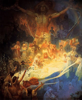
And why did Alphonse Mucha choose this particular blue and gold palette to express his deepest feelings about his Slavic homeland?
Let’s assume that you already understand the foundation terms:
--the color wheel or hue circle
--the concepts of hue, value, and saturation (aka chroma)
If you’re not sure about these ideas, you’ll find answers on Wikipedia or on the website Handprint (thorough and technical) or in most any book on color.

This basic color wheel has the various full-chroma hues arranged around the outside margin. Neutral gray is at the center. As each color approaches the center, the chroma decreases until it arrives at neutral gray.
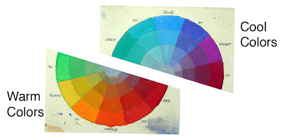
Let’s take the color wheel and chop it in half. On the bottom half are all the warm colors: from yellow-greens, to oranges, reds. On the top half are the cool colors, the blue-greens, blues, and cool violets.
Someone might argue about where to divide the wheel. The greens and violets seem to have divided loyalties. But if you consider the “heads of the families,” blue and orange, there seems to be some basic psychological difference between them.

The cool colors seem to evoke feelings of winter, of night, of death and sleep. They remind us of quietness, restfulness, and calm.

The basic feelings suggested by the warm colors are completely different. We associate the warm colors with fire, sunlight and blood. (Above, The Burning of the Houses of Parliament, by J.M.W. Turner.) They make us think of energy and passion. Orange and yellow are ephemeral colors. We see them only fleetingly in nature: at sunsets, in flowers, or in autumn leaves.
This basic perception of the two families of color seems to be woven into the fabric of our human existence. The anthropologists Paul Kay and Brent Berlin have studied the evolution of color terms in languages around the world. In European languages we have about 11 or 12 basic terms to describe colors.
But some non-Western languages, like the New Guinean language Dani, have only two basic terms. Kay and Berlin write: “One of the two encompasses black, green, blue and other ‘cool’ colors; the other encompasses white, red, yellow and other ‘warm’ colors.” (Link for full story in Scientific American).
Non-European people didn’t have poor vision; far from it. But rather, anthropologists suggest that as language evolved, it developed its first word-concepts around the most psychologically important divisions or groupings.
Many great painters of the past have discovered that you can achieve a full feeling of color from a palette restricted to warm and cool.
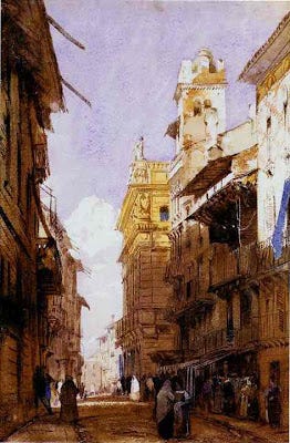
In a painting of one predominant family, an accent from the other side of the spectrum adds a lively contrast. Here’s a painting by Richard Parkes Bonington where he has enlivened his warm colors with a few accents of blue. Notice that there’s no green or red in this one. It’s painted almost entirely with blue and orange in various value ranges and degrees of saturation (mostly its duller cousins in the ochre and sienna ranges).

Warm and cool colors bring each other to life by these adjacent contrasts. This quick sketch of Venice by Sargent has a lot of areas where warm and cool are played against each other.

Many of Sargent’s best watercolors were painted primarily with two colors, probably ultramarine blue and raw sienna, exploring the dance between the cool and the warm. He must have been looking at other colors, like red and green, in the scene before him, but he was ignoring them.
This is beautifully analyzed. I had never thought about the idea of yellows being so ephemeral. That will stick with me forever, now.
Great article. I'd be putting that red-violet into warm colours and green into cool, for the split. I can buy that green's hot (even though I don't agree). I have a hard time believing that red-violet, or anything with red in, is cool, though.